06 · AppsCode · Design System
AppsCode UI modernization
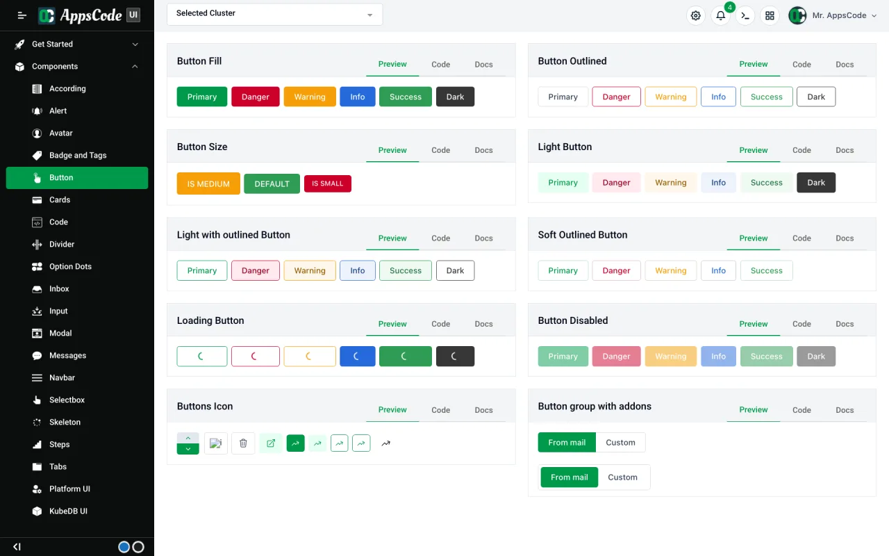
I designed and built AppsCode (opens in a new tab)’s new design system: a Tailwind CSS v4 theme and 109 typed Vue 3 components, made to replace the old Bulma library in every console without breaking a page.
- Repos moved to it: 4 apps, 3 libraries
- 7Repos moved to it: 4 apps, 3 libraries
- SCSS blocks removed, none left
- 175SCSS blocks removed, none left
- Month, with a team of 5
- 1Month, with a team of 5
- Designer
- Mohin Uddin
- Role
- Design System, UI Modernization, Vue Components
- Timeline
- AppsCode · migration project
- Technology
- Vue 3, Tailwind CSS v4, TypeScript, Vite
- npm package (opens in a new tab)live product
- Real screensfrom the live product
- Design and UI code by me
My role
- Designed and built the system: a Tailwind CSS v4 theme and 109 typed Vue 3 components, plus compat.css so new components run inside old pages.
- 5 people
- 1 month
Key result
0
Changes in behaviour for users while 7 repos moved to the new system
At a glance
- 01 · The problem
Replace the foundation under four apps and three shared libraries without stopping any of them.
Read the problem - 02 · The approach
Keep the names; change only how variants are passed.
See the approach - 03 · The result
Every front-end moved off Bulma and SCSS, and users noticed nothing but a cleaner UI.
See the result
01 · Context
Every AppsCode console ran on one Bulma and SCSS library.
- kubedb-ui, cluster-ui, platform-ui, billing-ui and selfhost-ui all load @appscode/design-system 2.x globally.
- Its components took Bulma class strings, like modifier-classes="is-danger is-light is-small".
- The apps import it by deep path in hundreds of files, so it couldn’t simply be swapped out.
02 · Challenge
Replace the foundation under four apps and three shared libraries without stopping any of them.
- Both libraries use class names like mt-4: 4px !important in the old one, 16px in the new.
- The old apps set a 13px root font size and keep their own spin and pulse animations.
- Every old page had to keep working while new ones moved over.
- This round moved kubedb-ui, cluster-ui, platform-ui and billing-ui, plus the ui-modules, form-builder and vue-openapi-form libraries.
03 · Thinking
Keep the names; change only how variants are passed.
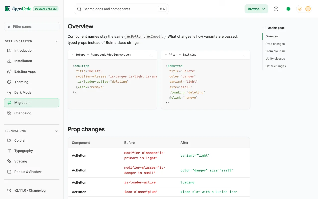
- AcButton is still AcButton. Bulma class strings become typed props: color, variant, size, loading.
- Match the cloud console exactly, checked against cloud-ui’s own source: colours, fonts, sizes, spacing and voice.
- Props are typed, so a wrong colour or size is a type error in the editor, not a class typo that ships.
- A Migration page maps every old prop to its new one, component by component.
04 · Design
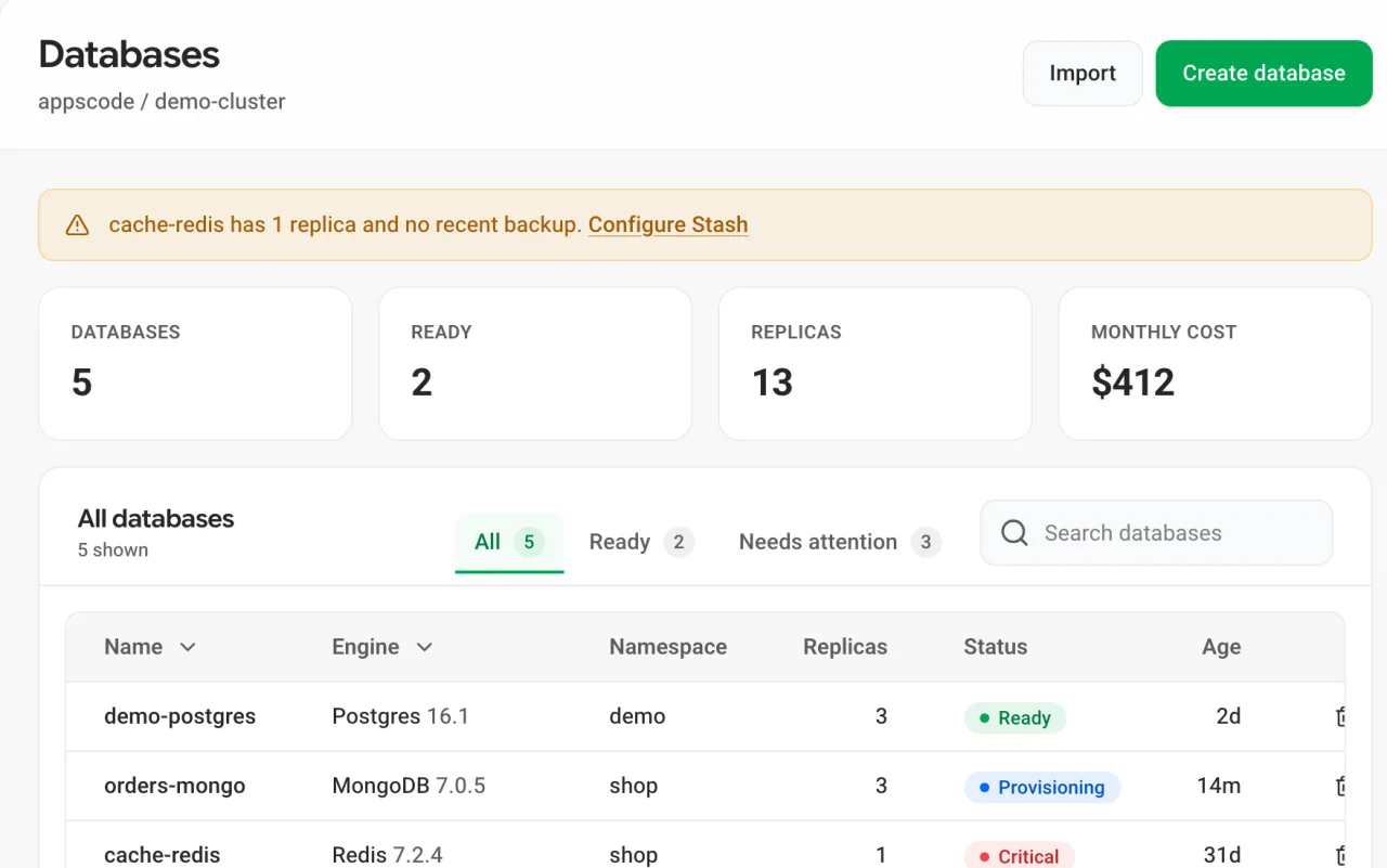
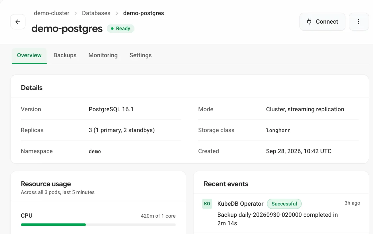
Whole console pages, built only from the system.
- Six example pages: database list and detail, a create form, settings, empty and error states, and the app shell.
- Every example uses real AppsCode data, so a developer can copy a page and start from it.
- Charts run on Apache ECharts, the engine cloud-ui already uses.
05 · System
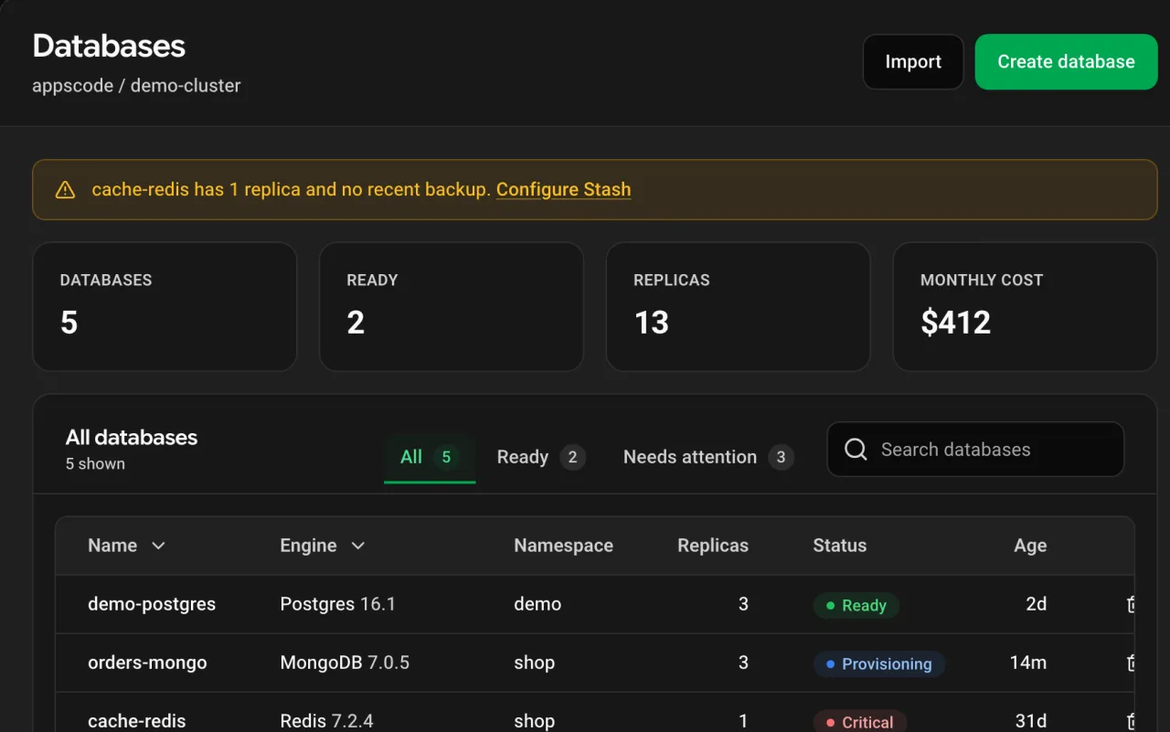
One Tailwind CSS v4 theme, in light, dark and the brand colour.
- Colours, Roboto and Google Sans Flex type, spacing, radius and shadows live in one theme.css.
- The brand hue can change at runtime, and old and new components re-hue together.
- Tailwind’s default palette, radii and shadows are cleared, so an off-brand class like bg-indigo-500 simply doesn’t exist.
- The brand green and success colour were darkened so white text passes WCAG AA.
- Drag across the page below to see the same screen in both themes.
 LightDark
06 · Engineering
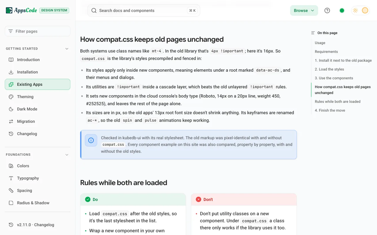
compat.css lets new components live inside old pages.
- Its styles apply only inside new components, under a root marked data-ac-ds.
- Its utilities sit in a cascade layer, which beats the old unlayered !important rules.
- Sizes are in px and keyframes are renamed ac-*, so the old 13px root and animations are untouched.
- Charts and editors ship as separate entries, so apps that don’t use them don’t download them.
07 · Outcome
Every front-end moved off Bulma and SCSS, and users noticed nothing but a cleaner UI.
- No Bulma or SCSS left: 175 SCSS blocks removed across the 7 repos, and the old styling packages are gone.
- One look for tables, modals, forms, buttons, the navbar and sidebars, with shared dark mode and text-size tokens.
- No functional behaviour changed, and the apps now ship noticeably lighter.
- Published on npm as @ac-design/design-system (opens in a new tab): 1.0.1 for the migration, now at 2.11.
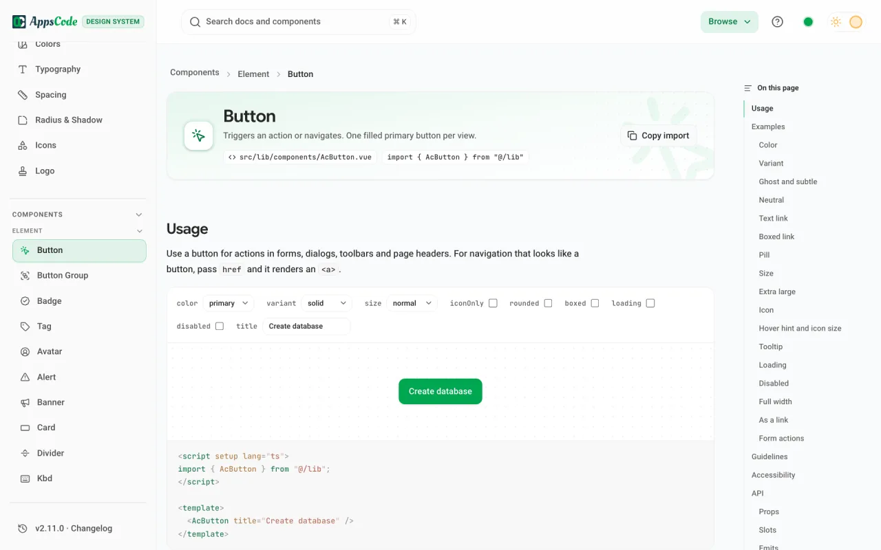
- One docs site for all of it: a page per component with a live playground, examples, guidelines, accessibility notes and API tables.
08 · Reflection
A migration works when nobody notices the old pages.
- Matching the console people already use mattered more than a fresh look.
- Next: merge the branches, run the end-to-end tests, and load cluster-ui’s heavy editors only on the pages that use them.
From the person who managed this work
“Mohin is not only a talented UI/UX engineer, but also a team player and communicator. He used various tools and methods to conduct user research, create wireframes and prototypes, test usability, and implement feedback.”