02 · AppsCode · Design System
AppsCode Design System
I designed and built the system every AppsCode (opens in a new tab) console runs on: one token file, 111 Vue components and the docs that teach them, so five consoles look, behave and read as one product.
- Components, editors and charts
- 111Components, editors and charts
- Consoles built on it
- 5Consoles built on it
- Bulma or SCSS left in 7 repos
- 0Bulma or SCSS left in 7 repos
- Designer
- Mohin Uddin
- Role
- Design System, UI Design, Vue Components
- Timeline
- AppsCode · ongoing
- Technology
- Vue 3, Tailwind CSS v4, TypeScript, Vite, ECharts, CodeMirror
- npm package (opens in a new tab)live product
- Real screenssensitive values blurred
- Design and UI code by meAPIs by the engineering team
My role
- Designed and built the whole system: tokens, theme, components, docs and the path for moving each console onto it.
- Me, with 3–4 console engineers who build on it every day and send fixes back
- Design systems at AppsCode since 2023; this is the current one
Key result
7
Repos moved off Bulma and SCSS without stopping work
At a glance
- 01 · The problem
Five consoles shared a brand, but not a way to build a screen.
Read the problem - 02 · The approach
I set four rules first, then built every component to keep them.
See the approach - 03 · The result
One system now runs every console, and each one ships far less CSS.
See the result
01 · Challenge
Five consoles shared a brand, but not a way to build a screen.
- The old Bulma library took class strings like is-danger is-light. A typo threw no error; it just shipped.
- Each console added its own SCSS on top, 175 blocks across seven repos, so the same button drifted from app to app.
- Dark mode, focus rings and loading states were rebuilt by hand on each page, and some pages never got them.
Before@appscode/design-system 2.x
<AcButton
  title="Delete"
  modifier-classes="is-danger is-light is-small"
  :is-loader-active="deleting"
/>After@ac-design/design-system
<AcButton
  title="Delete"
  color="danger"
  variant="light"
  size="small"
  :loading="deleting"
/>02 · Users
A design system has two audiences: the people who build with it, and everyone who uses what they build.
Console developers
Build the pages of cluster-ui, kubedb-ui, platform-ui, cloud-ui and billing-ui.
What got in the way Rebuilding tables, forms and empty states on every page, each one a little different.
Shared-module authors
Write the Vue modules every console loads, such as forms and editors.
What got in the way Making one component look right inside five apps with five sets of styles.
Console users
Platform engineers, DBAs and SREs who run clusters and databases.
What got in the way A new layout, a new button and a new kind of error message in every console.
03 · Thinking
I set four rules first, then built every component to keep them.
Rule 01
Name the intent, not the colour
Tokens say what a value is for, like text-muted or bg-surface. Tailwind’s default palette is removed, so an off-brand colour can’t even be written.
Rule 02
The safe way is the default
Loading, disabled, focus, errors and screen-reader announcements come built in. A developer sets a prop instead of writing the markup.
Rule 03
Move one page at a time
The same component names, typed props and a compat layer let a console move without a rewrite, while its old pages stay exactly as they were.
Rule 04
Show it, don’t describe it
Every component has a live playground, real AppsCode data and code to copy. Developers start from a working page, not a spec.
04 · Tokens
One token file decides every colour, size and shadow, in both themes.
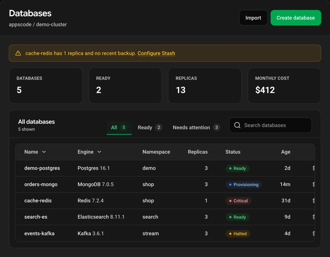
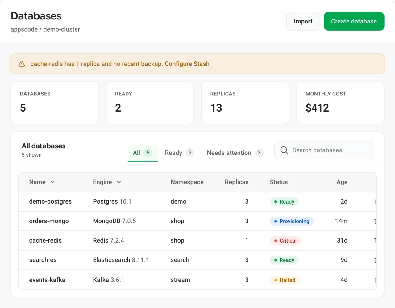
- Components hold no dark-mode code: the same classes render both themes, and a user’s saved choice carries over from the old apps.
- The brand hue can change at runtime, so a white-label customer re-colours the product without a rebuild.
- Each status colour has a stronger text shade that passes WCAG AA, so “Critical” stays readable on its own tint.
- Drag across the page below: one screen, two themes, no extra code.
 LightDark
05 · Components
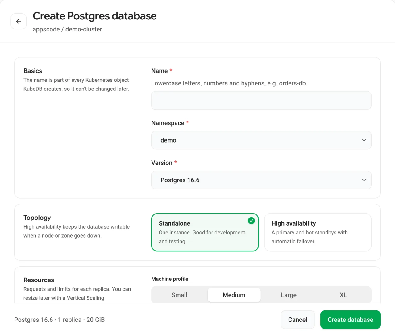
Forms are most of what a console does, so every field explains itself the same way.
- useFormValidation gives every field its own message without a validation library, and AcFormArray replaces hand-built “add item” tables.
06 · Shell
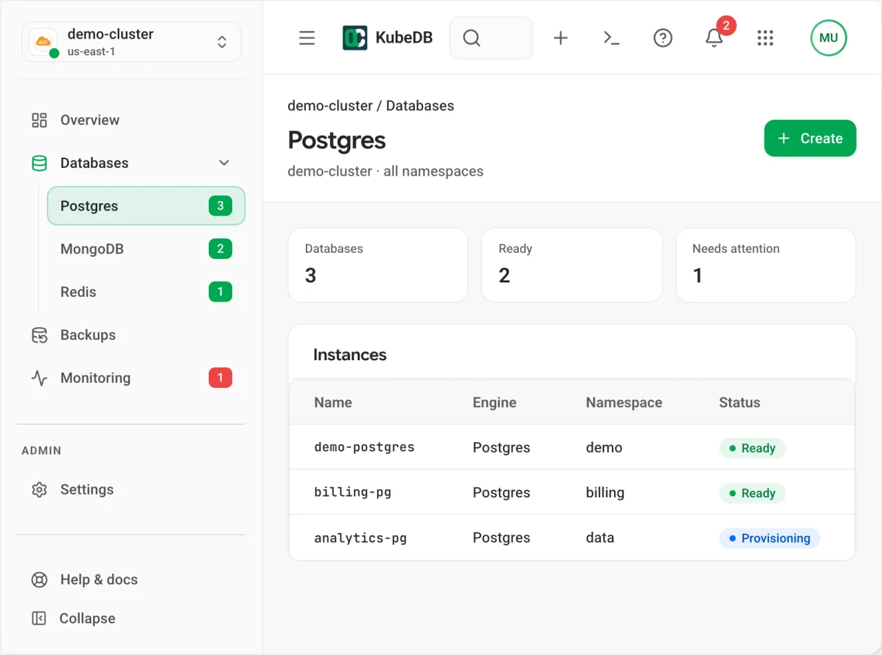
Every console opens in the same frame, so people always know where they are.
- On a phone the sidebar becomes a drawer and the navbar shows a menu button, with no layout code in the app.
07 · States
Empty, loading and no-access screens are where people decide whether to trust a console, so each one says what happened and what to do next.
- AcEmptyState and AcErrorState ship these patterns, so a page can’t end up blank by accident.
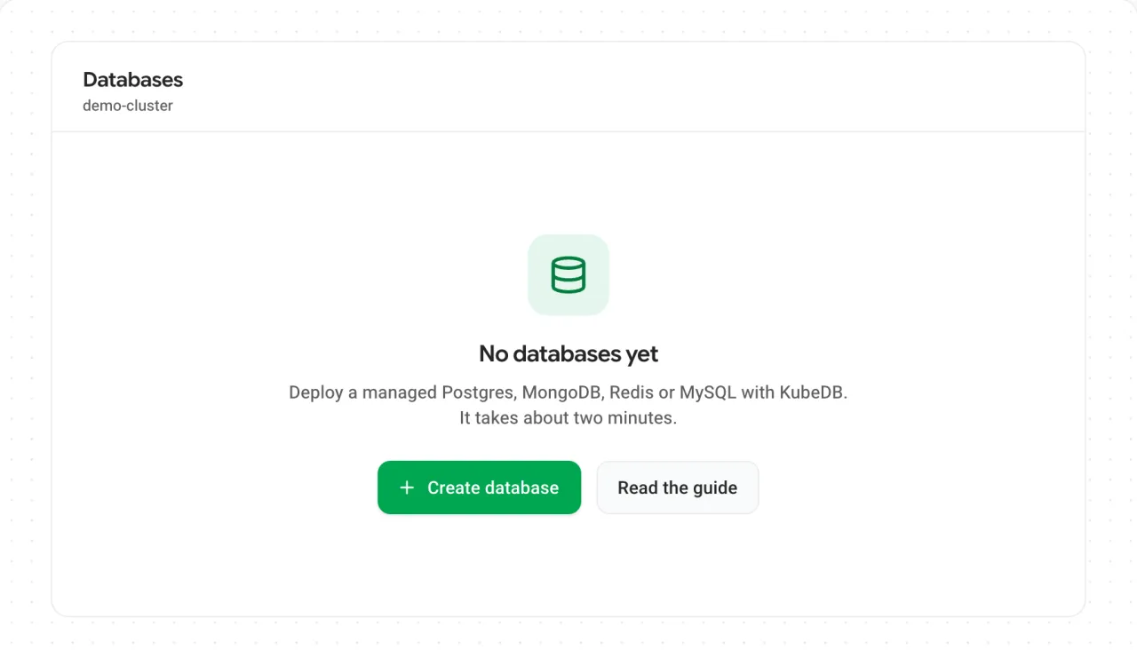
Empty: says what belongs here and leads with the action that creates it 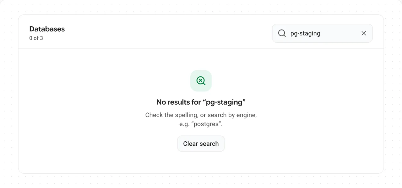
No results: repeats the search, suggests what to try and offers to clear it 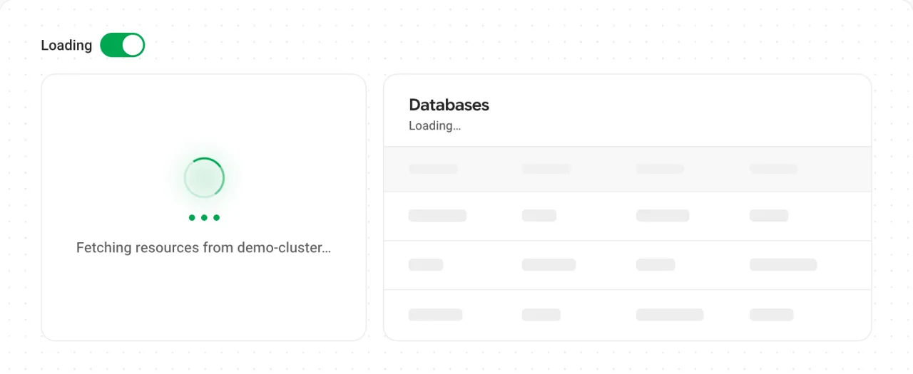
Loading: says what it is fetching, and tables keep their shape with skeleton rows 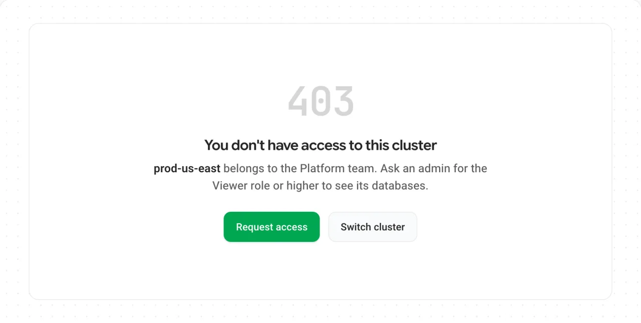
No access: names who owns the cluster and the role needed, with a way to ask for it
08 · Adoption
Seven repos moved onto it without stopping work, one page at a time.
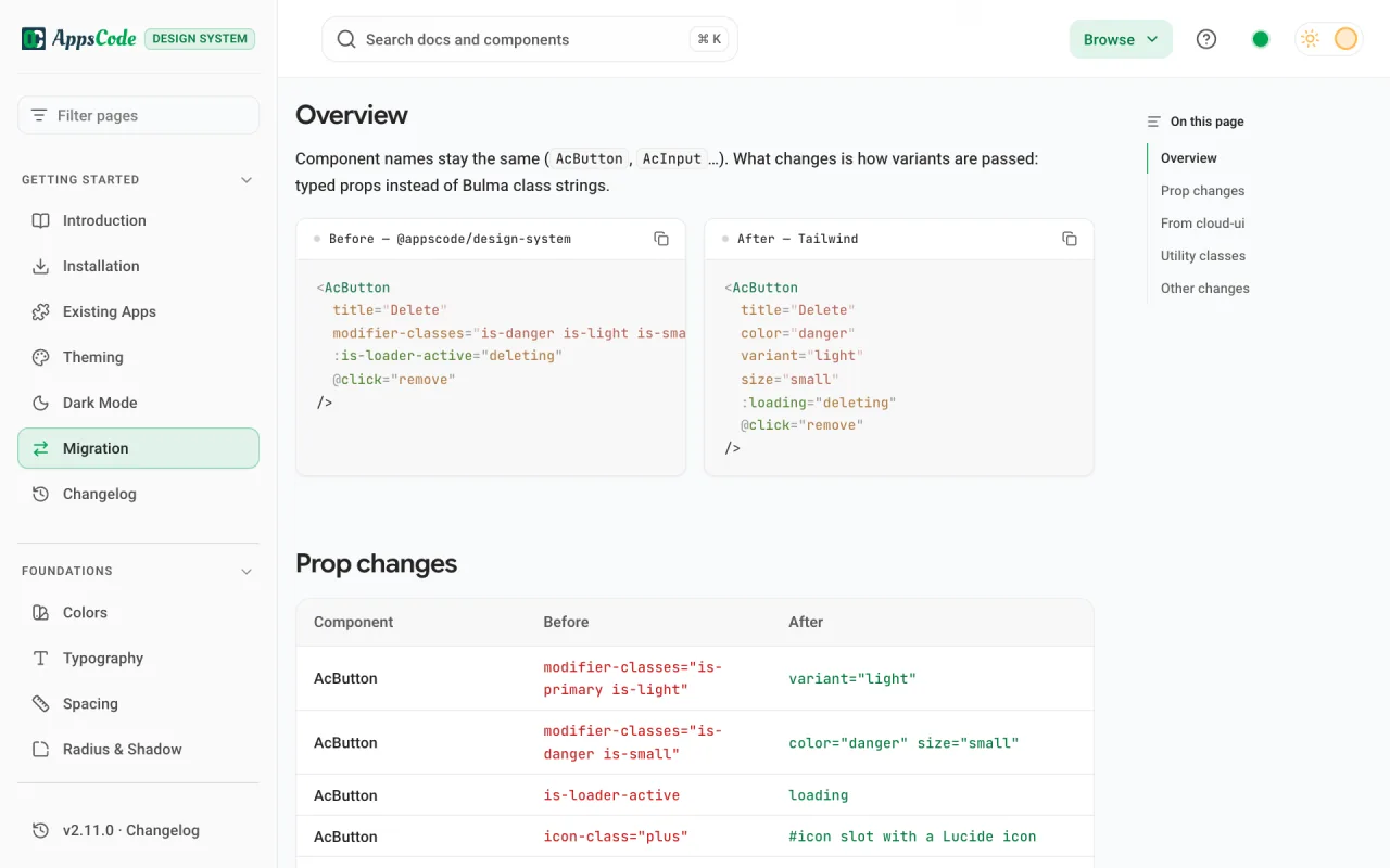
- compat.css fences the new styles in, so old pages stay pixel-identical beside new components. I checked it in kubedb-ui.
- A migration table maps every old prop to its new one, which turned the move into a checklist.
- Charts and editors ship as separate entries, so a console downloads ECharts or CodeMirror only if it uses them.
09 · Outcome
One system now runs every console, and each one ships far less CSS.
- Four consoles and three shared libraries moved onto it, and no Bulma or SCSS is left. It is published on npm as @ac-design/design-system (opens in a new tab).
- CSS per console, gzipped: cluster-ui 397 to 34 KB, kubedb-ui 138 to 37 KB, platform-ui 111 to 28 KB.
- A fix in one component reaches every console on the next upgrade, and a new page starts from a working example.
- What I learned: consistency came from good defaults, not from rules people have to remember.
From the person who managed this work
“Mohin is not only a talented UI/UX engineer, but also a team player and communicator. He used various tools and methods to conduct user research, create wireframes and prototypes, test usability, and implement feedback.”